

Key Takeaways
- The medical billing analytics dashboard provides practices with a real-time view of KPIs that directly impact practices’ revenue and collections.
- Tracking AR, denials, payments, and billing trends helps teams identify revenue problems before they become harder to recover.
- Built-in benchmarks and detailed financial data help billing teams pinpoint problems, prioritize follow-up, and make faster decisions.
Revenue problems quietly build up through rising denials, manual errors, aging ARs, and slower payments. Imagine waiting for a complete practice audit at the end of the month, only to see that denials have increased, more payments are sitting in ARs, and your first-pass rate has also slipped.
That’s exactly where a billing analytics dashboard plays its role. Instead of compiling numbers from different reports, a dashboard provides a single view of the revenue cycle. It can track various KPIs, such as denial rate, days in AR, net collection ratio, and first-pass rate.
This post walks through the 9 KPIs that belong on a billing dashboard, the industry benchmarks for each, and how PracticeEHR's dashboard puts them all on one screen.
Why Monthly Reports Cost Medical Practices 5-15% of Revenue?
The usual setup is this. The biller runs a report once a month, maybe twice. The report is a static snapshot. By the time it hits the practice manager's inbox, the numbers describe a problem that is already three or four weeks old.
That delay costs money in a few specific ways.
Manual reports show stale data, so denials get caught after the appeal window has already shrunk. AR aging remains invisible until the 90+ bucket becomes unworkable. There is no industry benchmark on the screen, so a 65% first-pass rate feels fine until you learn the industry median is above 90%.
And if you run multiple locations or multiple providers, consolidating their numbers in Excel takes a full day of someone's week.
A dashboard fixes this by making the current month's data available right now, with context. That is the whole pitch.
The 9 Medical Billing KPIs PracticeEHR Tracks (With Built-in Benchmarks)
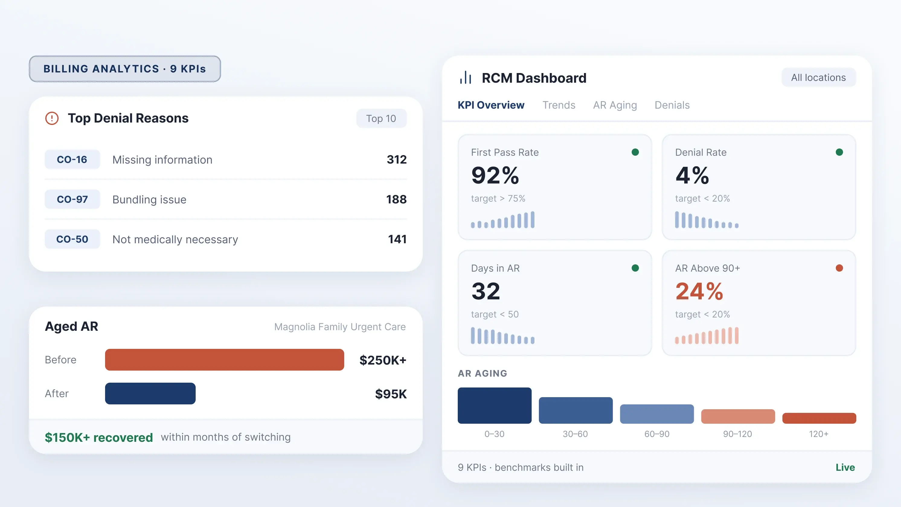
Every KPI card on the dashboard shows your YTD average, your target, and a mini trend line. You see at a glance whether the metric is on pace or slipping. These are the nine we track, with the benchmarks baked into the product.
| KPI | What It Measures | PracticeEHR Benchmark |
|---|---|---|
| First Pass Rate | Share of claims accepted on first submission | > 75% |
| Denial Rate | Share of claims denied | < 20% |
| Days in AR | Average days to collect | < 50 |
| AR Above 90+ | Share of AR older than 90 days | < 20% |
| Turnover Ratio | How quickly AR converts to cash | < 1.5 |
| Net Collection Ratio (NCR) | Collected revenue vs. collectible revenue | > 90% |
| Collection Per Visit | Revenue earned per patient encounter | practice-set |
| Avg Days to First Payment | Payer response speed | target 20 |
| Charge Lag (Days) | Days between encounter and bill | < 2 days |
Most dashboards expect you to memorize benchmarks or go hunting through MGMA reports to know what good looks like. We put the number on the screen next to your result.
How a Revenue Cycle Dashboard Works: 9 Tabs Explained
Strong revenue cycle management starts with a dashboard that puts the right data at your fingertips. PracticeEHR’s RCM dashboard brings everything together across nine dedicated tabs.

Here is what each one shows and the decision it drives.
-
KPI Overview: Spot Problems in 30 Seconds
Nine KPI cards with YTD averages, target lines, and mini trends. Filters at the top for Practice and Location. A Benchmarks panel on the left that shows the industry targets we score you against.
Instead of digging through individual reports, you can immediately identify which areas need attention. A KPI falling below target can signal a problem with collections, denials, AR, or payment speed before it affects overall revenue.
Use this tab first thing in the morning, because if any of the nine cards are below the target, you know where to spend the day.
-
Year-Over-Year Trends: Catch Seasonal Dips Early
This tab shows charges, payments, and adjustments trended month-over-month, with last year overlaid on the same chart. You can also toggle between 2024, 2025, and 2026.
Year-over-year comparisons make seasonal patterns and unexpected changes easier for you to spot. If charges or payments begin falling behind compared to the same period last year, your team can investigate the cause before the gap becomes harder to recover from.
This is the module that catches seasonal dips before they become a crisis. If August charges are tracking 20% below last August by the third week, you have time to figure out why.
-
Monthly Financial Activity: Days in AR Projection
A table showing Charges, Payments, Adjustments, Bad Debt, AR, Days in AR, GCR, NCR, and Turnover Ratio for every month of the year. Below is a Projected Monthly Summary for the current month showing Yesterday, Month-to-Date, Monthly Projection, and Daily Average.
The projection is the useful part. It can give you an early view of where the month is headed. Rather than waiting until month-end to review results, you can identify a potential shortfall early and determine whether additional follow-up or collection activity is needed.
Three days into the month, you already know where you will land if nothing changes.
-
Financial Metrics: Root-Cause Any KPI Drop
The deep table. It shows AR 90+, %AR 90+, Charge Count, Charges with last-year comparison, Charge Lag, Payments with last-year comparison, Adjustments, Collection Per Visit, Avg Days to First Payment, First Pass, Denial Rate, Turnover Ratio. Cells are color-coded red and green, so weak months pop immediately.
The "Select KPI to See Trends" panel below the table plots shows any single metric over time. Good for root-cause work when a KPI goes sideways. This is where you can move from “something is wrong” to “what is causing it?” The trend panel lets you isolate an individual KPI and see how it has changed over time.
The module will help your billing team investigate the underlying issue instead of relying on a single month-end number.
-
Patient AR vs Plan AR: Where Your Money Is Stuck
This module splits the Active AR into Patient AR and Plan AR each month. Additionally, sub-tabs for AR Summary, Current AR Distributions, and AR by Financial Class answer the question every practice manager asks: Is it the patients or the payers?
The split between Patient and Plan AR helps your team identify where outstanding revenue is concentrated. Rising Patient AR may indicate issues with patient balances, statements, or collections, while rising Plan AR may indicate issues with claim processing, payers, or follow-up.
-
AR Aging Report: Stop the 90+ Day Bleed
AR is aged into 0-30, 30-60, 60-90, 90-120, and 120+ monthly buckets, with a trend chart on the right. You can also see the AR Aging by EOD and AR Aging by Financial Class from the Sub-tabs. Watch the 120+ line. If it is climbing while 0-30 is flat, your follow-up team is losing ground.
Aging helps your team prioritize the AR that needs the most attention. A growing 90+ or 120+ balance can indicate that claims or accounts have been unresolved for too long and need to be resolved. It gives your team a clear signal to increase follow-up or investigate the underlying cause.
-
Denial Management: Top Reason Codes & Trends
The seventh module will show you the top AR Denial Reasons table with Reason, Reason Code, Count, Patient %, Plan %, Total %, and Denied Charges. A Top 10 chart on the right. Sub-tab for Show Denial Trends.
Fixing the top three denial reasons usually halves the total number of denials. The reason codes make root cause obvious: CO-16 means missing information, CO-97 means a bundling issue, and CO-50 means the service was not deemed medically necessary. You can tell which part of the workflow to fix.
Instead of treating every denial as a separate issue, your team can identify the patterns behind them. Understanding which denial reasons and codes occur most often helps you focus on the workflow, coding, documentation, or payer issues contributing to preventable denials.
-
AR Follow-up Tracking: Is Your Billing Team Collecting?
Follow-up Collection Trend shows Payment, Follow-up Collection, and Follow-up Collection 90+ by month. At the bottom, there’s a Current AR in the Follow-up table with reasons such as Adjustment Not Done, AI Patient Not Found, AI Out of Network, and a bar chart of the top 10.
This tab shows whether your billing team is actually converting follow-ups into payments. If follow-up hours are up but follow-up collection is flat, something in the process is broken.
-
Payment Trends by Payer: Spot Underpaying Insurers
The last module shows Adjustments by Financial Class and Payments by Financial Class side by side. These tables also have columns for Last Week, Month-to-Date, Year-to-Date, Previous Month, and Prior Year MTD.
Below is a Collection Trend chart for the last 12 months, split into Plan Payment, Patient Payment, and Plan Writeoff. This tab adds a Provider filter on top of the Practice and Location filters.
The module is useful for two things: identifying payers who are underpaying relative to last year and spotting providers whose collections lag the group.
Multi-Practice, Multi-Location, Multi-Provider Filters
Every screen filters by Practice and Location. The Payments tab adds a Provider filter. If you are running multiple clinics across various cities, you can view consolidated financials for the group or drill into a single site in one click. No exports, no VLOOKUPs.
3 Real Workflows: How Practices Use the Dashboard
Three ways teams use the dashboard to move the numbers. These are illustrative workflows, not case studies with real client data.
-
Cutting Denial Rate from 12% to 4%
The Denials tab shows the top reason codes. The Financial Metrics tab shows which months are getting worse. A biller works the top three codes for one quarter, usually missing modifiers or incorrect patient info, and the denial rate drops to single digits by month three.
-
Bringing the days in AR from 55 to 32
The AR Aging tab shows which bucket is bloating. The Follow-up tab shows whether the team is actually working on the oldest claims. Reassign the 90-120 bucket to a dedicated AR specialist, and the number comes down within a billing cycle.
-
Lifting NCR to 98%+
The Financial Metrics tab compares charges to payments against the same period last year. When a payer pays 7% less for the same code than they did 12 months ago, you know to pull the contract, renegotiate, or appeal.
A Case Study: How Magnolia Family Urgent Care Recovered $150K in AR Using PracticeEHR
One of our clients, Magnolia Family Urgent Care, an urgent care practice in Ocala, Florida, was sitting on more than $250,000 in aged AR with no visibility into where the money was stuck.
Their first-pass claims rate was under 50%, meaning more than half of every submission required rework. Internal turnover had broken the continuity of their billing operation, and credentials were falling through the cracks.
They moved to PracticeEHR's billing and RCM service, which paired them with a dedicated RCM team, the built-in analytics dashboard covered in this post, and 24/7 single-point-of-contact support.
The results, measured over the first few months:
| Metric | Before | After |
|---|---|---|
| Aged AR | $250,000+ | 90,000–100,000 |
| First-pass claims rate | Under 50% | 92–93% |
| AR Recovery | — | $150,000+ |
| RCM team continuity | Broken by turnover | 100% stable |
What the dashboard surfaced:
- The AR Aging tab exposed which buckets held the stuck revenue
- The Denials tab surfaced the root causes, pulling down the first-pass rate
- The Follow-up tab confirmed that the RCM team was actually working on the aged claims
"Our previous AR was almost a quarter of a million dollars. Now it's lingering at $90,000 to $100,000, that's 50 to 70% better." — Ali Raan, Magnolia Family Urgent Care.
Magnolia is now planning to expand to a second location and is evaluating PracticeEHR's AI Scribe for clinical documentation.
Explore how Magnolia Family Urgent Care fixed its revenue cycle, using PracticeEHR’s billing tools →
What is a Good First Pass Rate for Medical Billing?
A good first pass rate for medical billing is above 90% for top-performing practices, with the industry median at 85%. Anything below 75% indicates a workflow problem, usually due to missing modifiers, incorrect patient demographics, or outdated eligibility data. Every percentage point below 90% adds 2–3 days to average AR and 1–2% to the overall denial rate.
MGMA 2025 benchmarks place top-quartile practices at 92%+, with variations by specialty. It places dermatology trends higher (93–95%), behavioral health lower (82–87%) due to authorization complexity.
The PracticeEHR KPI dashboard shows your first-pass rate against the 75% target in real time, so you catch dips as soon as they start, not the month after.
For a real-world example, Magnolia Family Urgent Care lifted its first-pass rate from under 50% to 92–93% using the billing dashboard's denial-reason tracking; see the Magnolia case study above.
How Do You Reduce Days in AR?
Reducing days in AR requires fixing both front-end and back-end gaps:
- Cut charge lag to under 2 days — same-day entry gets paid 7–12 days faster
- Prioritize follow-up by aging bucket — recovery rates drop from 85% at 60 days to under 30% at 180 days
- Fix the top 3 denial reason codes — every denial adds 15–30 days to AR
- Run eligibility verification before every visit — kills 25% of denials at the source
See the "Bringing Days in AR from 55 to 32" workflow above for how practices execute this using the AR Aging and Follow-up tabs. Magnolia Family Urgent Care applied this approach and recovered over $150,000 in aged AR within months, cutting their total AR from $250K to roughly $90K.
What Should Your Medical Practice's Denial Rate Be?
Your denial rate should be under 10% to match the industry median and under 5% for top performers. Above 15% is a warning sign; roughly 1 in 7 claims requires rework, adding staff cost and extending AR by 15–30 days per denial.
Industry average: 8–12%. Primary care: 6–9%. Behavioral health and surgery centers: 12–18% due to prior authorization and documentation complexity.
Three codes drive most denials:
- CO-16 (missing information) — fixable at charge entry
- CO-97 (bundling) — fixable with modifier use
- CO-50 (not medically necessary) — fixable with documentation templates
Fixing the top three codes typically cuts total denials 50–60% in one quarter. The "Cutting Denial Rate from 12% to 4%" workflow above walks through exactly this process. Magnolia Family Urgent Care's first-pass rate jumped from under 50% to 93% implies a parallel drop in the denial rate in the same period.
PracticeEHR Billing Dashboard vs. Spreadsheets vs. Generic EHR Reporting
| Capability | PracticeEHR | Spreadsheets | Generic EHR Reporting |
|---|---|---|---|
| Real-time data | Yes | No, manual refresh | Usually overnight batch |
| 9 KPIs built in | Yes | Build your own | Depends on the vendor |
| On-screen benchmarks | Yes | No | No |
| YoY comparison | Automatic | Manual | Limited |
| AR aging buckets | 5 buckets, by financial class | Manual | Yes |
| Denial reason tracking | Yes, with reason codes | Manual | Limited |
| Followup tracking | Dedicated tab | No | Rare |
| Multi-location filter | One click | Rebuild per site | Rare |
| Monthly forecast | Yes | Manual | No |
| Cost | Included in PracticeEHR | Staff hours | Usually extra module |
Medical Billing Benchmarks 2026: MGMA, HFMA & HBMA Industry Standards
MGMA, HFMA, and HBMA publish annual benchmarks for medical billing performance. Our targets are set to match the top-quartile numbers from those reports.
Here is what good looks like, per the latest industry data:
- First Pass Rate: Top performers run above 90%, median around 85%. We set the floor at 75% because anything lower signals a workflow problem.
- Denial Rate: Industry median is 5-10%. If you are above 15%, you are losing money every week.
- Days in AR: MGMA best practice is to keep it under 40 days. Under 50 is acceptable; above 60 means your AR process has slipped.
- AR Above 90+: Top quartile keeps this under 15%. Above 25% is a warning sign.
- Net Collection Ratio: 95% and above is the goal. Anything under 90% means you are writing off collectible revenue.
The dashboard shows your YTD average against our target on every KPI card. You do not have to go find a benchmark report to know how you stack up.
Read more: How the Revenue Cycle Management team keeps a practice’s revenue optimized?
FAQs

.svg)
